
I'm not sure that I can adequately explain this, but "Left Bank Two", a popular De Wolfe library track recorded by Dutch outfit The Noveltones in 1963, is one of those musical compositions that automatically sets my hair on end. Take that series of advertisements for the Volkswagen Golf Mk4 from 1998, in which a succession of characters communicate, in lieu of spoken dialogue, by holding up a hand-written sign with some kind of revelatory statement about their innermost selves. I found the results creepy as hell, something I attribute 100% to their choice of musical accompaniment. It's a jaunty piece for sure, and any agency that opts to feature it in their advertising no doubt does so with the intention of relaying a sense of whimsy, but for myself that whimsy has always come in heavy quotation marks. "Left Bank Two" sounds to my ears like a strangely mocking tune, like there's a joke that everyone else is laughing at but I'm not getting - a joke that, for all I know could be at my own expense. Its presence invariably makes the atmosphere feel slightly cursed.
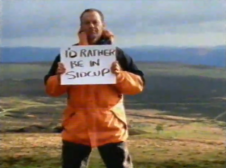
I could be in the minority, though. BMP DDB, who devised the campaign, likely selected the track for its nostalgic properties and because it has, for multiple UK generations, been a track associated with self-expression. "Left Bank Two" rose to prominence when it was used in the "Gallery" segments of BBC children's program Vision On (1964-1976), in which viewer-submitted artwork was showcased before the screen. The track became so iconic that it was retained for sequel series Take Hart (1977-1983) and Hartbeat (1984-1993), both presented by Tony Hart, who had co-presented Vision On, and for CBBC series SMart (1994-2009), which kept it relevant well into the 00s. Its appearance here is a clue that, just as those unassuming pencil sketches served as charming little windows into their young creators' souls, so too are the signs in the Golf campaign meant to be heartfelt statements on who their holders really are. In a way, my own interpretation seems perfectly fitting, since there is an extent to which the central joke of the campaign is very much at the viewer's expense. The nature of the signage is about subverting the narratives we might otherwise be inclined to project onto the subjects - the mismatch between what you see and what you get, as the tagline puts it. Some offer expressions of surprising vulnerability (the fisherman who complains of seasickness, the hiker who's reached the top of a rock formation only to decide that the experience is unfulfilling and he'd rather be in Sidcup). Other statements disclose traits that might not ordinarily be attributed to their authors, be they emotional (the "sensitive" nightclub bouncer), intellectual (the model with an IQ of 158 or, far more absurdly, the toddler who writes out a complex maths equation) or carnal (the very prim and proper woman in a supermarket car park who reveals her twin obsessions with chocolate and sex). Elsewhere, a businessman at a train station gestures to their fluid sense of identity, with the message, "At weekends my name is Mandy", the statement that most sharply encapsulates that discrepancy between how the subject presents for the sake of societal convention, and how they actually identify.
For these figures, the hand-written sign becomes a form of empowerment, a compelling shorthand for a secret being confided between the subject and the viewer, as an inner act of rebellion against the social constraints that would otherwise define them. Such defiance, the campaign suggested, made them soulmates of the Golf Mk4 itself, the humble exterior of which concealed a whopping 2864 improvements - as was boasted on the sign accompanying the vehicle in the closing image of each individual. I am aware of at least three different versions of the ad, each of which offered a slightly different arrangement of figures, and pictured a different character positioned beside the Golf at the end, as a further reinforcement of their spiritual alliance. In one, the bouncer. In another, the fisherman. In the third, the naturist who doesn't play volleyball.

The volleyball-shunning naturist stands out as by far the most puzzling of the subjects, given that the signage itself functions as a form of constraint that would at first appear to run contrary to the overall premise. Societal convention requires that she keeps her offending parts covered on daytime television, a purpose that her message, split across two strips of cardboard, conveniently serves. This does mean that she's denied the freedom of physical movement, lest the inoffensive arrangement be disturbed, a point emphasised by the highly animate nature of the other unclothed campers seen whizzing past on bikes and kicking footballs. Then again, her statement indicates that she wishes to be defined by her inactivity. Her dour expression, in contrast to the merriment unfolding around her, is a further indicator that she isn't the carefree, fun-loving naturist of stereotype. In one of the campaign's more touching situations, another subject, a man wearing a heavy frown, goes a step further and uses his sign, showing a drawing of a smiling face, to obscure his entire image, as a complete rejection of the outward narrative. He evidentially isn't great at expressing emotion, but wants you to know that he's a kindly soul within. (Did I say it was touching? The crude smiling face is honestly more disconcerting than the frown. But the gesture is noted and appreciated.)
The campaign was the cause of some controversy, when artist Gillian Wearing, a then-recent recipient of the Turner Prize, accused BMP DDB of having ripped off the concept from her 1992/93 project, Signs That Say What You Want Them To Say and Not Signs That Say What Someone Else Wants You To Say. In Wearing's case, members of the public were approached and given a marker pen and blank sign with which to create their own message. As with the Golf campaign, a large part of the appeal of Wearing's images lay in the disconnect between the subject and their selected statement - the most infamous had a well-dressed businessman holding a sign that said, "I'm desperate". Wearing contended that many of the scenarios used by BMP DDB were too similar to be coincidental (she felt, for example, that the nightclub bouncer holding up a sign that said "Sensitive" was evocative of her own image of a policeman holding up a sign that said, "Help"), but ultimately chose not to pursue legal action, citing a recent case in which director Mehdi Norowzian had sued Guinness and lost, following claims that their "Anticipation" campaign had borrowed excessively from his 1992 piece Joy. For their part, BMP DDB denied that they had stolen Wearing's idea, indicating that she was merely one of several sources that had fed their inspiration, (another being the iconic promo video to Bob Dylan's 1965 single "Subterranean Homesick Blues"). Myself, while I don't really blame Wearing for being cheesed off at what she saw, I think that some of the alleged connections are rather too tenuous to suggest transparent copying. I suspect that businessmen making "surprising" revelations were a feature of both because businessmen are an easy bunch to categorise as nondescript. A bouncer holding up a sign that says "sensitive" makes for a disarming image, but doesn't have quite the degree of troubling irony as a policeman holding up a sign reading "Help". It would be inaccurate to suggest that the Golf campaign is devoid of social commentary (the ads are, after all, exercises in the unreliable nature of perception, and the toddler who's a maths whizz notwithstanding, there's no reason why the featured scenarios couldn't accurately describe any real-life people), but its main intention was presumably to be cute rather than challenging.
Regardless of whether or not the campaign pilfered its premise wholesale from Wearing, her objections highlight the other sense in which the joke here is ultimately at the expense of the viewer. As is noted by Russell Ferguson in the 1999 publication Gillian Wearing, "It is all the more painfully ironic...that the visual style of [Signs] has been repeatedly co-opted for commercial advertising - the epitome of signs that say what someone else wants you to say, of self-expression defined as your choice of commodities." (p.48) Whereas Wearing's work evokes the unpredictability and spontaneity of the everyday, the scenarios in the Golf campaign were entirely manufactured, and purposely designed to convince us that the ultimate form of self-expression is to buy a Golf. Just as the subjects' statements become shorthands for individuality prevailing in the face of society's preconceived notions, the Golf becomes a shorthand for their personal statements - to the point where there is nothing personal or individual about it. The apparent self-empowerment afforded to each figure, in getting to direct the course of their own narratives, inevitably steers us to the exact same conclusion, with the Golf Mk4 and its 2864 improvements. Still, with the sinister sauce of "Left Bank Two" at its disposal, it can scarcely fail to have its own eccentric vibe.
No comments:
Post a Comment